The Pitfalls of Percentages in the News
Why percentages mislead, and what journalists can do about it
by Jonathan Stoneman
In my work as a trainer, I have spent quite a lot of time looking at how journalists use numbers in their output – and especially percentages. There is plenty of advice about using numbers in general, but less about percentages.
Numbers need to be used with care in journalistic output – not too many of them, make them relatable, don't use decimal places, and so on. But when we get to percentages the rules change – or that's how I see it.
Proportions
Percentages, as well as other proportions such as numbers per 100,000 in a population, help to put the number into context. So, for example, when considering numbers of migrants arriving in various European countries it's useful to put the number in the context of the whole population. For example: Germany is the EU member with the largest population, and it takes in a lot of migrants – but only 15 per 1000 inhabitants, while Malta tops the table at 76 migrants per 1000 inhabitants.
When we however look at rarer events, such as murder, we tend to express proportions in terms of number per 100,000 – because we get larger, mostly whole, numbers – so, in the USA, Washington DC topped the murder league table in 2024 with 25.5 murders per 100,000, five times the US average, and more than double the worst state – Louisiana with almost 11 murders per 100,000 in 2024. Looking at the US average alongside the top 9 locations, we get a chart like this:

Clearly it makes sense to compare numbers according to the total population. But it is too tempting when writing about a chart like this to take the reported numbers alone, divorced from their true context, and say something like 'you are more than twice as likely to be murdered in Washington DC than you are in Louisiana'. This sounds awful – and is just the kind of emotive headline that gets clicks.
It's tempting too, at this point, to start to take this set of results and use the spreadsheet program's ability to bamboozle the audience with big numbers: 'Washington's murder rate is 236% that of the worst state in the union Louisiana'.
Likelihood
There is a peculiar branch of 'journalese' (the language used only by journalists) which uses this formulation – "A pedestrian or cyclist hit by a truck was 90% more likely to face serious injury than one hit by a regular car, and almost 200% more likely to be killed".
Personally, I hate this formulation – it's a kind of false use of statistics, and if you google the phrase '% more likely' in news items you will see how widespread it is. It takes the numbers out of their original context, and, making past results a predictor of future performance, creates this weird expression 'percent more likely'. It forces the reader to do some mental gymnastics. In fact '90% more likely' is easier to understand once you realise that 90% is close to 100% and a 100% increase equates to a doubling of the original figure. And a 200% increase is not a doubling as the 2 might imply – it's a tripling.
The '% more likely' is possibly true if things stay the way they are, but it would be truer to say that 'last year the number of people seriously injured when they were hit by a truck was almost double the number injured by a regular car. And three times as many pedestrians were killed in collisions with trucks than were killed by regular cars'. Much easier to understand – but, of course, it takes a bit longer to say; the 'journalese' version is shorter – but leaves the reader to do the maths.
When it comes to falls in numbers, the journalese is even harder to understand – one of my favourite examples was "Eating 2oz of chocolate a week makes you 46% less likely to die of a stroke." What does that mean in real numbers? I have no idea. In my head, I see something like this:
The column on the left is 46% smaller than the one on the right – but wouldn't it be easier to say 'about half'?
Percentages in data visualisations have long made me uneasy – in the sense that it's too easy to use them as if they themselves were 'numbers'. They're not – they are percentages representing a proportion of one number to another.
Percentages are not normal
I couldn't find anyone else saying this in advice on visualisations, so I went back to first principles.
Why we use percentages
- To show proportions
- Put numbers in context, for example growth, relationship to the whole, or another part
- Help to compare apples and oranges when that's necessary, for example the same percentage of asylum seekers in the German population, the American and the British will be different numbers of people, but it's helpful to put these raw numbers in relevant context as we saw above with the US murder rates.
Downsides to using percentages
- They can give a false appearance of 'objectivity' or spurious accuracy, especially when the sample size is small (<100)
- They can give a false impression, for example rise in crime from a low base: 30 crimes committed last month, 36 this month = 20% increase. Yes, but it's just 6 more crimes in a month. So you need to show the two raw numbers.
- Arithmetic isn't as straightforward with percentages as with raw numbers. If visits to a website this month were 10k and next month 13k, that is 30% increase. But a month later a fall back to 10k, it's a 23% drop. If you only look at the increase and decrease percentages you might be tempted to say – it's a net increase of 7%. But in reality you're back exactly where you started.
Similarly, as we saw above a 100% increase is the same as doubling. But a 100% decrease is not a halving – it means the number falls to 0. These are obvious when you look at them with actual numbers in mind, but this is an important reminder that percentages do not 'behave' the same as 'normal' numbers.
This is why we should stop and think when a percentage increase is more than 100%: Price of gas rises from $3/unit to $6.50/unit looks, on my calculator, like an almost 117% increase. Mathematically it is, but it's safer and clearer simply to tell people it has more than doubled, or simply tell them what today's price is compared to yesterday's.
Context is key
When you start putting percentages on charts you also have to think about it carefully. Let's look at the British population, and net migration for the last 4 years. If you could only use one of these three charts, which one would you choose?

For me the last one is the best – there's context there.
When plotting percentages on a chart – you can be super clear – like this taken from Ada Homolova's blog – using bubble size AND percentage on the x-axis to build the context into the picture.
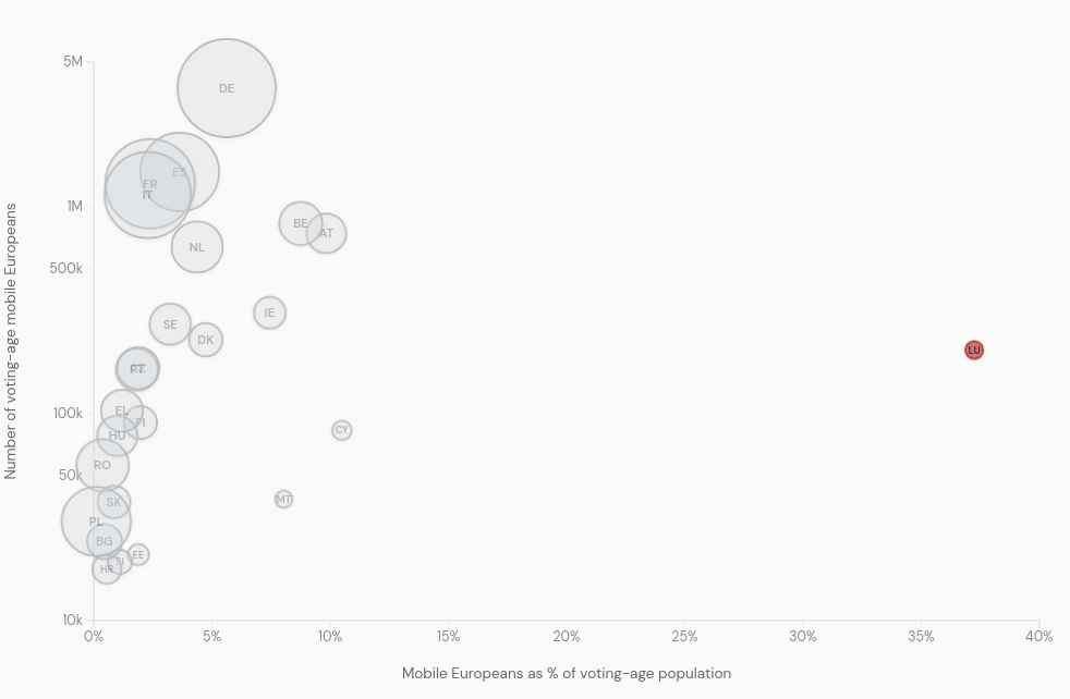
Where the percentage of population of voting age in each country is shown on the x-axis – the dot size reminds the reader of the relative size of the population – so Luxembourg's percentage is huge (and it is remarkably high by any measurement) but the dot reminds you that Luxembourg has a small population, while Germany's big bubble shows it has the largest population of mobile voters in the EU even though its percentage within the German population as a whole is only around 5%.
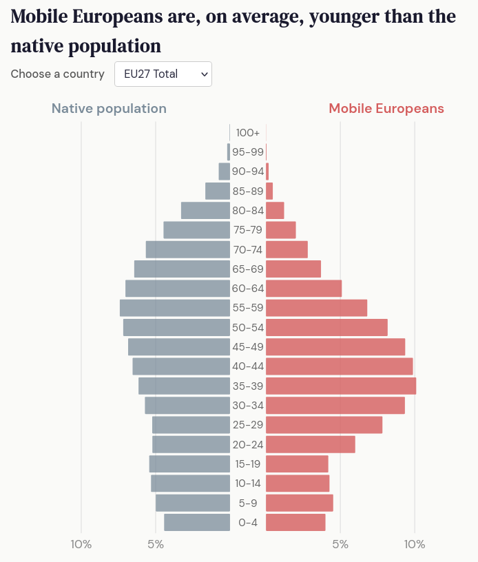
Where I start to feel uneasy is when the results are removed from the underlying raw numbers. So – when showing the numbers of mobile Europeans broken down by age in percentages of the population it is easier for the reader to start reading them in absolute terms.
Here we see a country with a large population – Poland, next to one with a comparatively small population – Croatia. If you come to these without the context, or without knowing the relative sizes of the populations, the reader may get misled (or rather – mislead themselves) because it's too easy – at this point – to read the charts as if they were raw numbers, not percentages.
These examples work fine, because the visualisations are still only a click or two away from their original context. But in a world where people are happy to manipulate facts to fit their own narratives, looking at a visualisation where the axes show percentages, and there's no sign of the original data, we should be very wary!