Hands-on data training for journalists and other data storytellers.
1-on-1 sessions to level up your data skills scheduled around your time and project.
“The data journalism mentorship with Ada improved my way of reporting and transformed my approach to stories.”
Sarah Emler
Reporter at ORF (Austria)
“Ada's bright personality together with her encouraging teaching style put a smile on my face at every session.”
Charlotte Wirth
Freelance investigative reporter
“Ada has fundamentally reshaped my long-term approach to journalism.”
Freelance investigative reporter
A community for and by nerds in the newsroom.
What makes a good map for your story, plus a hands-on intro to QGIS, the best free mapping tool.
No coding knowledge needed — a systematic approach to prompting so you can get an LLM to code anything.
Also: come learn about maps! Now for real.
What text embeddings are and how to put them to work in practice.
Read the words as critically as you read the numbers — what a health-data Pondcast taught us about LLM bias.
Also: come learn about maps!
Uncovering narratives and insights from healthcare expenditure data.
Also: come learn about embeddings and how to find even more stories in data!
Build intuition for what pivot tables do, how to read them, and how to construct them from a question.
What tidy data is, the most common ways spreadsheets go wrong, and a checklist to confirm your data is analysis-ready.
A step-by-step checklist to interrogate any dataset and surface story angles — from first look to context checks.
Let the computer track your units and never miscalculate gigatons vs megatons again.
Discussing methods for measuring carbon dioxide emissions.
Why percentages mislead, and what journalists can do about it.
Color theory fundamentals and 4 essential tools for better palettes.
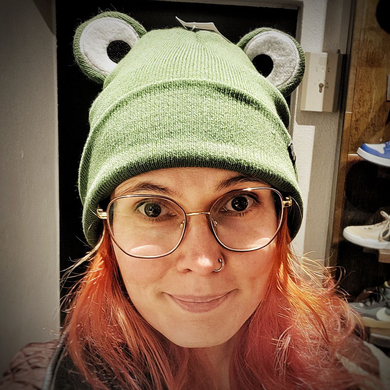
Data Journalist & Educator
Hi! I'm Ada. I am a freelance data & investigative journalist and teacher. Over more than 10 years, I made a lot of stories with small and big datasets and I am here to share what I learned along the way.
From the start of my career, I’ve loved helping other journalists get comfortable with data, brecause I believe these skills should be for everyone. Over the years, I’ve given countless lectures, taught at conferences like Dataharvest and NICAR, given guest lectures in the Master’s program in Gothenburg, and mentored journalists 1:1 through programs like IJ4EU.
I founded Data Frosch by accident, because I bought a frog hat last winter. It's a fun way to put myself out there and help others find me.
If you are curious about my extended portfolio have a look at my website. Connect with me on LinkedIN, or subscribe to personal newsletter!